BRANDING
NATURAL HEALTH BY ALEIGH
Caversham, Reading
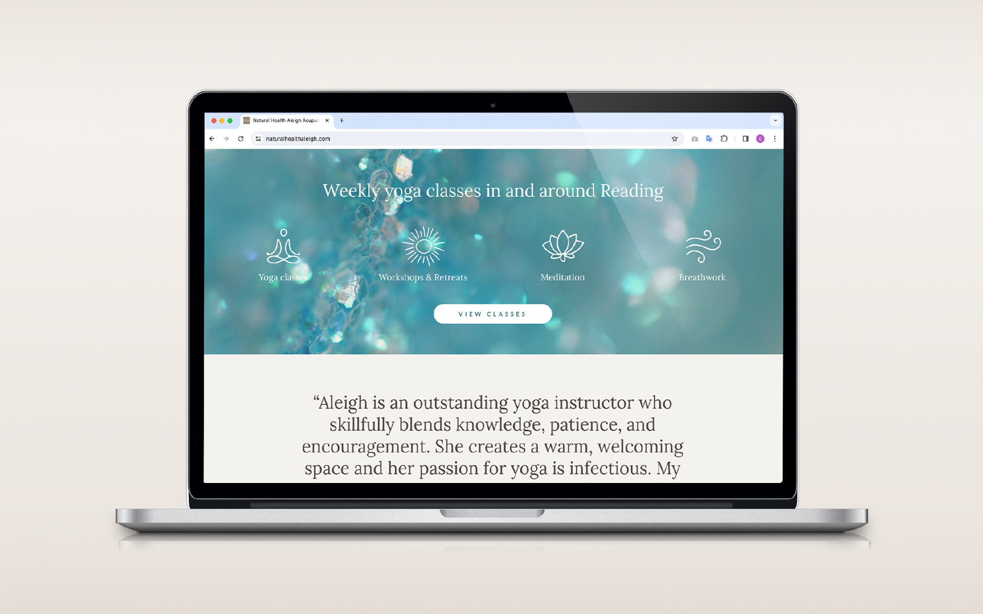
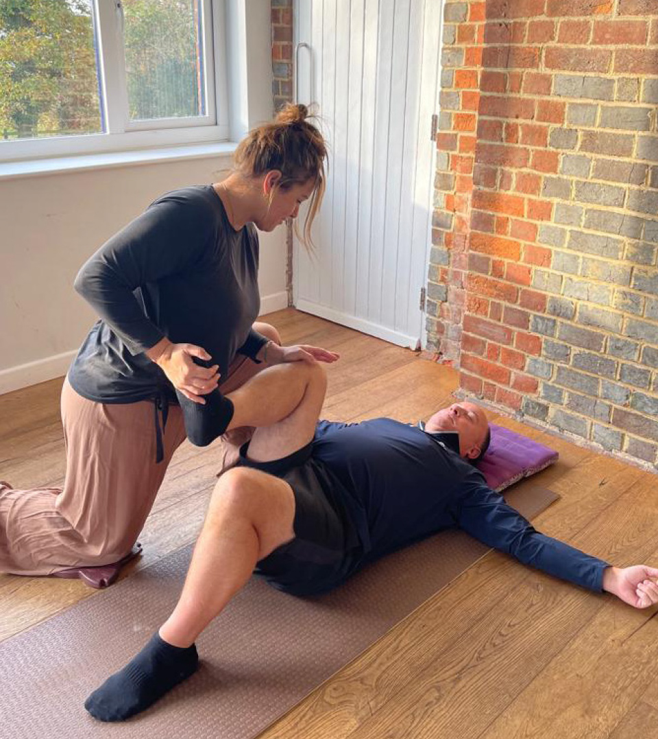
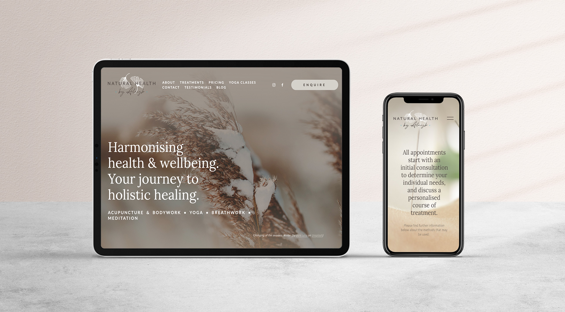
Aleigh came to us with the desire to create a brand and website that would help promote her acupuncture clinic. Having practised and taught yoga for many years her holistic and natural approach to whole body healing needed to come across in the brand style and website offering.
We started by brainstorming appropriate names and then worked on creating an identity that encompassed her wide therapeutic offering, from acupuncture & bodywork, yoga, breathwork and meditation.
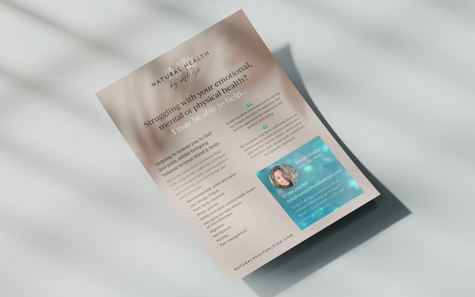
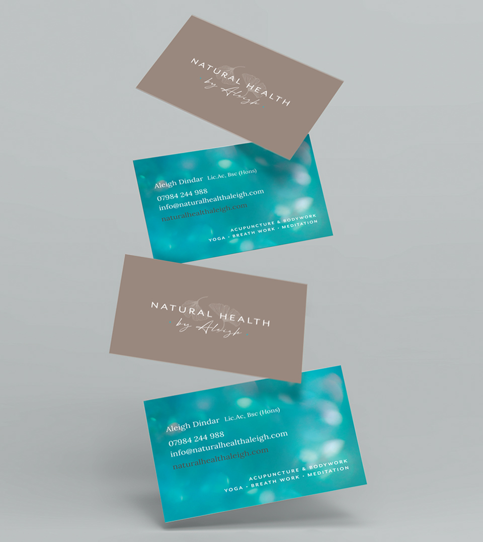
The identity, which consists of a stylised illustration of the Chinese plant, Ginko Biloba is formed to create a subtle ‘Ying Yang’ symbol. The logo represents health, balance and harmony and nods towards Chinese medicine and ‘Qi’ (energy flow).
A website promoting both her clinic, and yoga classes was created. This, along with flyers, business cards and setting the style for her online social media presence has helped to generate a host of new clients.
BRAND CREATION • LOGO/IDENTITY DESIGN • WEBSITE DESIGN • MARKETING • COPYWRITING