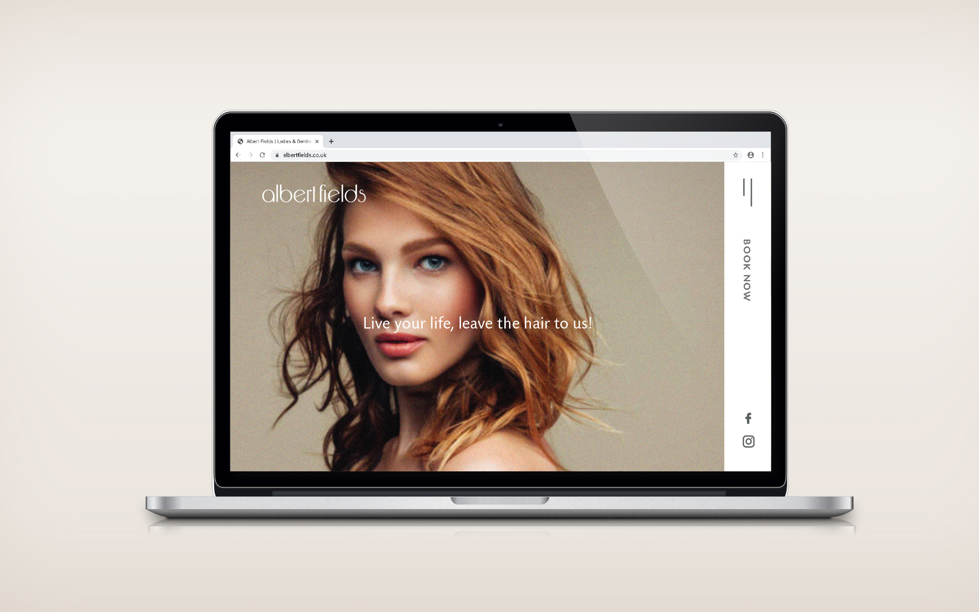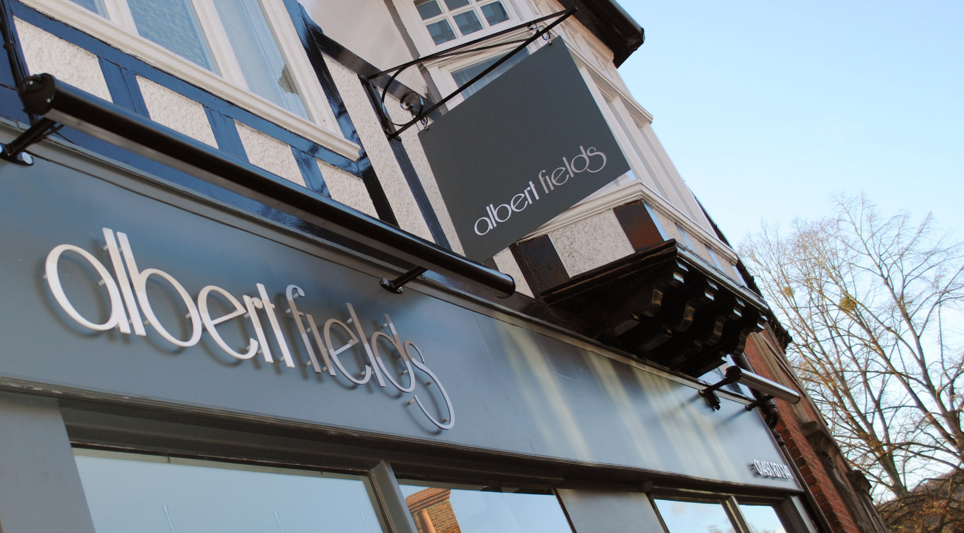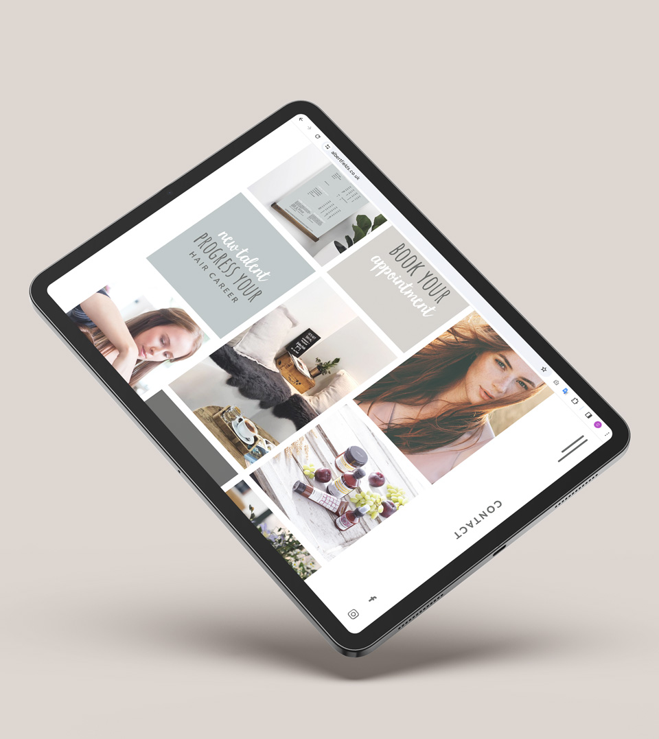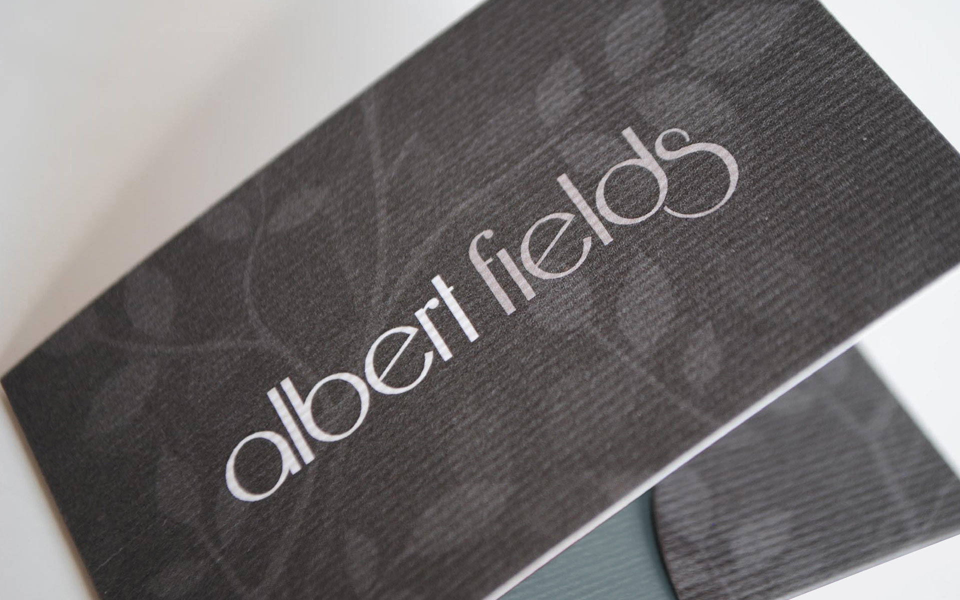

BRAND DESIGN
ALBERT FIELDS
Boutique hair salon in Goring-on-Thames
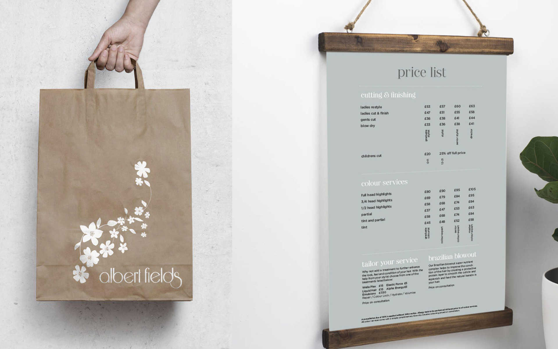
Our client had a vision to create a naturally welcoming and relaxing hair salon in the heart of Goring-on-Thames. The chosen name ‘Albert Fields’ combined family heritage with the aspirational vision of a fresh and inviting summer meadow.
Beautiful and inspiring plant and flower patterns are the basis of the brand look and feel and blend alongside the soft tone and curls of the identity typeface. A feminine and neutral colour palate was chosen with a highlight of duck egg blue to signify the vibrancy of the staff and salon creating a chic and stylish brand.
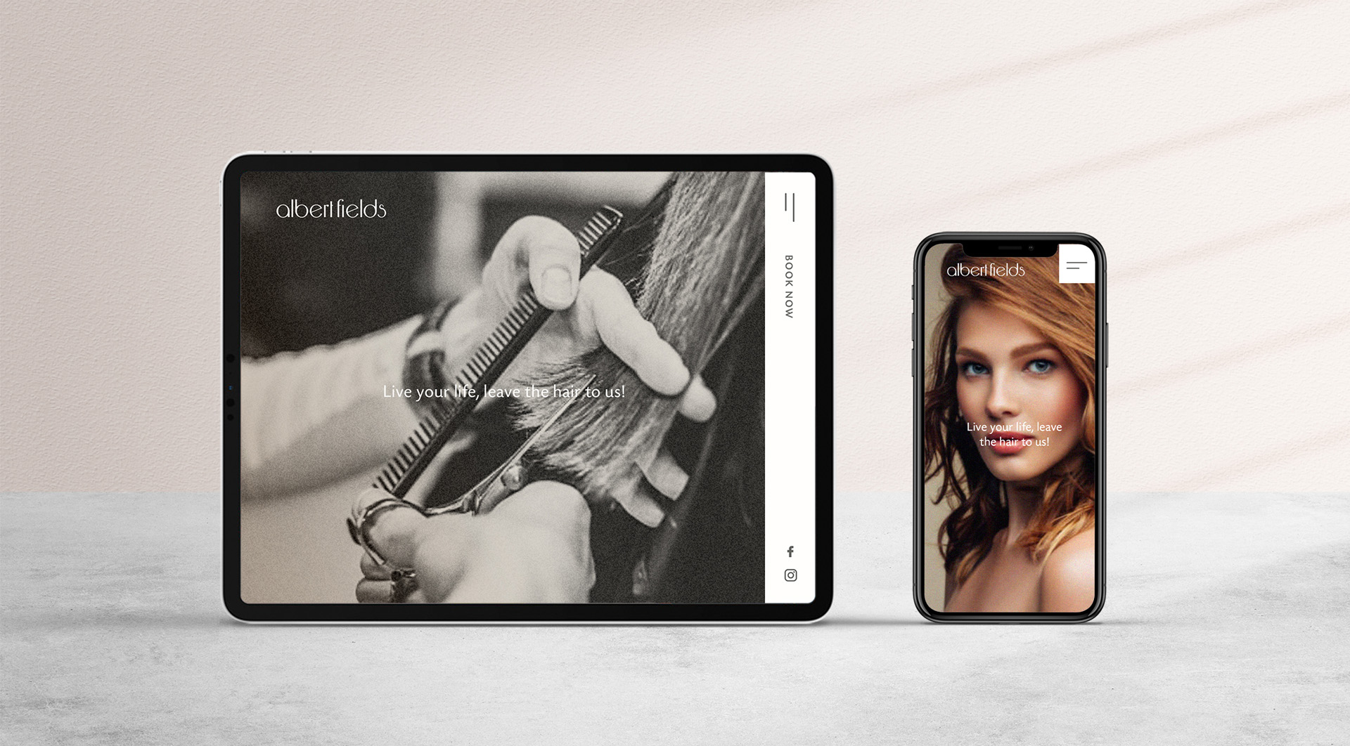
BRAND CREATION • LOGO/IDENTITY DESIGN • SIGNAGE • WEBSITE DESIGN • GRAPHIC DESIGN • ADVERTISING • COPYWRITING • INTERIOR DESIGN
The Albert Fields logo has recently been shortlisted by DesignRush, in the catergory ‘The Best Hair Salon Logo Designs’.